Example of how you use data mining/visualisation to solve a problem
4. Give an example of how you use data mining/visualisation to solve a problem?
The human brain processes visual information better than it processes text — so using charts, graphs, and design elements, data visualization can help you explain trends and stats much more easily.
Data visualization allows you to organize data in a way that's both compelling and easy to digest.
Some examples of visualization that solve problems:
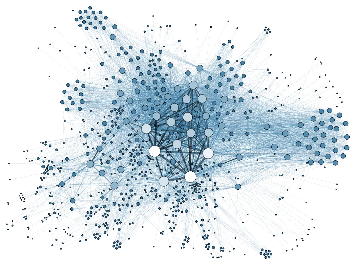
A Guide to Who is Fighting Whom in Syria:
Relationships among many different groups can be difficult to understand — especially when there are 11 of them, many of which are on the same side as groups they're normally at odds with, and vice versa.
But using a table format and familiar visuals and colors, Slate simplified this data into a simple, digestible, and interactive format.

Most Valuable Sports Franchises
Here's an example of telling a deeper story by adding data. The interactive visual lets users see the number of years each team has competed, as well as number of championships won. This offers a more comprehensive view of each team’s history and success as a franchise.

U.S. Wind Map
Here's a visual similar that shows the wind speeds and directions in the U.S. in real-time back in 2015.
It's a great example of intuitive design: Speed is represented by lines moving slowly or quickly, and direction is represented by which way the lines are moving.


Comments
Post a Comment